Exploring web and app typography
Nov 12, 2024A subject for confusion
When it comes to working with text on the web and mobile apps, there are many things to untangle — like unclear terms, unwritten rules, and technical details. Questions I often ask or hear others in the industry repeating include:
- Are font and typeface the same thing?
- What is the optimal font size for body text on a desktop versus a mobile device?
- What are the best practices for line height and letter spacing?
- How should text adjust when a user zooms in and out of their browser?
- And, by the way, what exactly is the difference between zooming in on a browser and adjusting the root font size on a laptop?
My goal for this article is to enhance my understanding of these topics, and, by documenting the journey, create an overview that can serve as a reference whenever any of the above questions - or others - arise.
To begin with
Lets start by getting a hang of these different terms: typography, typeface, font and font-style.
Typography is defined as the style and appearance of text in published form. It is the umbrella including typeface, fonts, text size as well as spacing of lines, letters and words. It is an art form that dates back to the 11th century and it was originally studied for its use in printed material such as newspapers and books.
Typefaces and fonts
As for typeface and font: I find I'm constantly confused by these terms, and it does not make it easier that they are used interchangeably by many people in the industry. The fact is that they explain different aspects of typography. source
A font is a character set: a specific visual design of letters, numbers, and symbols used in writing or typing. Simply put it determines how text looks when you see it on a screen or printed page. While a typeface, also referred to as a font-family is a family of related fonts that differ in attributes like width, weight and possibly different styles. For example Montserrat is a typeface and the variations of light, regular and bold are fonts.

To make it just a bit more confusing, typefaces can be categorized into main types as well, with the most used ones being serif and sans-serif. (But there are more to explore for any one interested in diving deeper in this area.) Serifs are the small features at the end of strokes within letters, while letters without serifs are referred to as sans-serif. In the below example I’m using Roboto-serif as the serif representation and Roboto as the sans-serif representation.

WCAG text guidelines
Now we have some of the base terminology down, lets move on to the topic of responsiveness. I chose to read about what the Web Content Accessibility Guidelines (WCAG) had to say about this, often overlooked aspect within UX design and web development.
Resize Text (Level AA), Success Criterion 1.4.4
WCAG has recommendations about text resizing to ensure that visually rendered text can be successfully scaled, allowing people with mild visual impairments to read without assistive technology. Stating that your text content satisfies the criterion if it can be scaled up to 200%.
From the perspective of a front-end developer building a website, it is primarily the browser's responsibility to provide the functionality for scaling text and content. But the developer also plays a crucial role, specifically developers should:
- ensure that their web content does not prevent browsers from effectively scaling text and content.
- verify that their content supports text resizing, ensuring usability when text size changes.
- in case the browser does not support zoom functionality, developers must provide this functionality directly. Alternatively they should ensure that the content works with the available functionality.
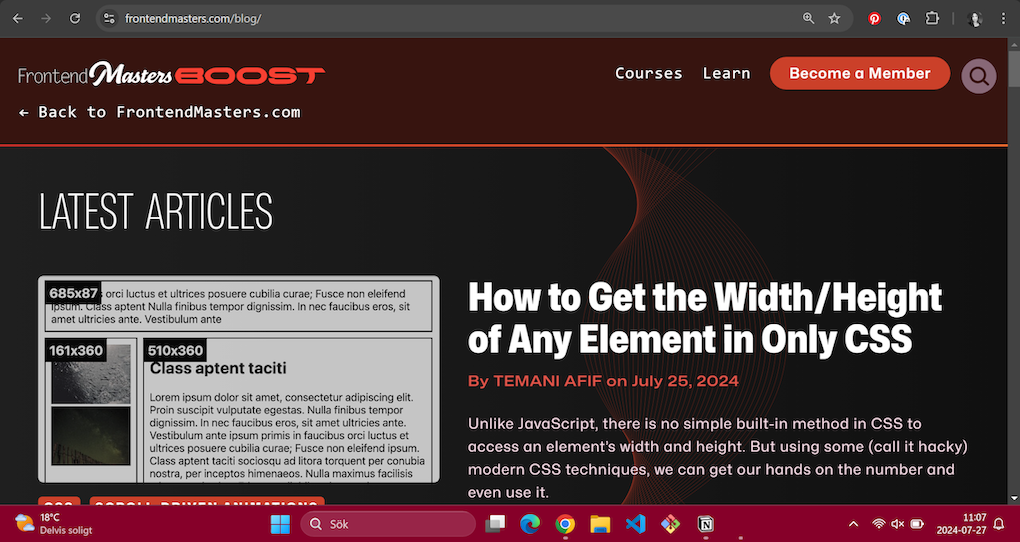
So what does this look like in practice? An example could be a user with a vision impairment increasing the web page text size in a browser from 1em to 1.2em to improve readability. Or a user utilizing the zoom function in the browser to scale up the content, with all the content scaling uniformly as the browser provides scroll bars if necessary. WCAG gives some recommendations on how to achieve this: ensure that text containers resize with the text, and use relative measurements like percentages, em units, or named font sizes. Here is an example of how this looks on FrontendMasters website. See how the different techniques affect the web site, and how the second option using zoom, is also scaling the containers with the font size.
The site in 100% zoom
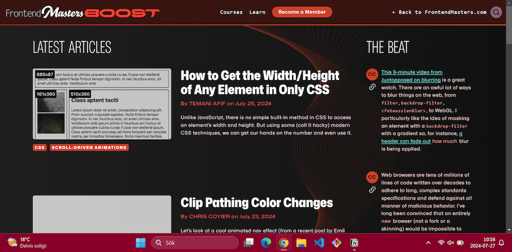
Changing the web page text size from medium to very large.
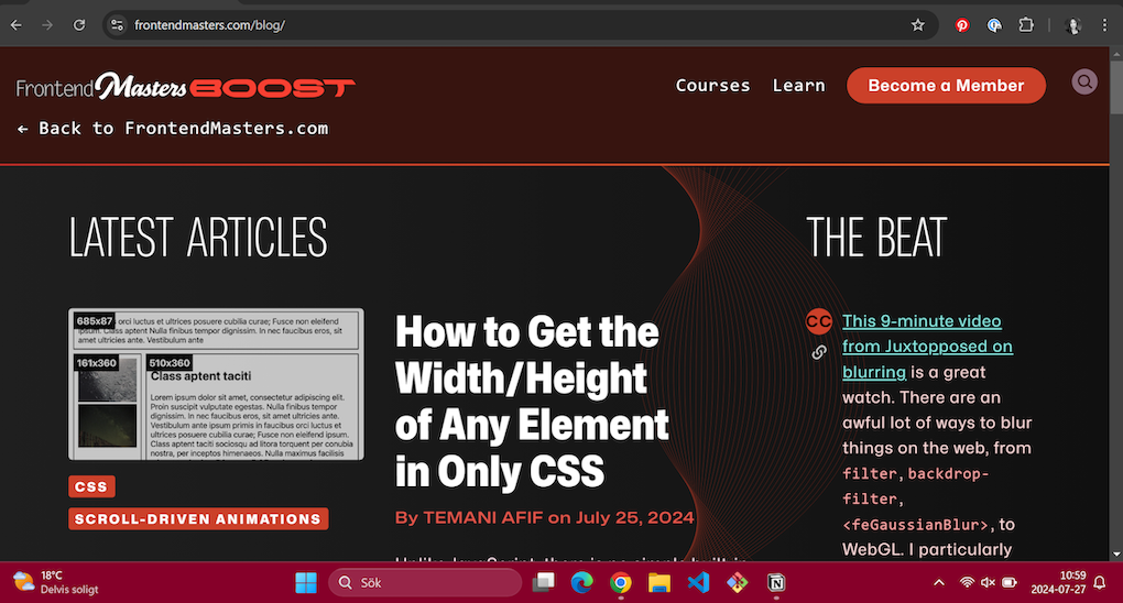
Changing the web text size back to medium and using the zoom function in the browser to scale up the content from 100% to 150%.
For each technique WCAG recommend to meet their success criterion, they have detailed documentation, including how to test it after implementation. This is, for me, an underused resource that I will be using more frequently going forward.
Recommended font size and font style
Moving on from accessibility considerations to more decorative aspects of typography. Where do we start when choosing our fonts?
Choosing typeface
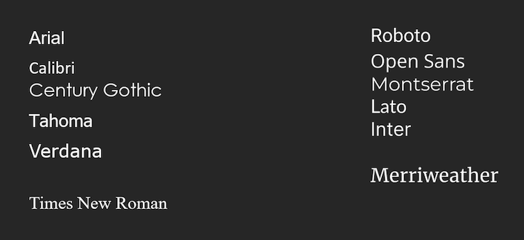
The first step in choosing a font is selecting your typeface. Styles should be clean, simple, and not too decorative. In general the ticks and tails of serif fonts for example, take up more space on the screen. Some examples of typefaces that are optimal for readability even for users without visual impairments are Times New Roman, Verdana, Arial, Tahoma, Helvetica, and Calibri. For website and app creators who want to take this to the next level, there are fonts created with people with dyslexia in mind: Read Regular, Lexie Readable, and Tiresias.
Accessible typefaces from Windows Accessible typefaces from Google fonts
Choosing font
Now that we have chosen our typeface, it's time to focus on the fonts. Arguably the most important factor in making a font accessible is how readable it is to all users.
There are four typographic characteristics that directly impact the readability of a font: font weight, character spacing, x-height, and line height. What looks good on a desktop might translate differently to smaller mobile devices, so keep in mind to test typography adjustments across various devices. source
Font weight
Font weight impacts how light or dark we perceive text. A bold text looks darker, and if too dark it can become unreadable. Light fonts are generally more readable because of there cleaner and less chunky style. But if the perception of the text is very light we can experience dropouts.

Character spacing
Character- or letter spacing, has the power to enhance the visual balance of a font. Avoid overly tight or overly loose spacing, as both can hinder readability. The optimal spacing can differ between font sizes. A smaller text under 16px can benefit from a slight increase in the character spacing, while a larger text such as a headline might be more readable with less spacing.
source
Additionally, letter spacing plays a crucial role in accessibility. Research indicates that wider spacing can improve reading comprehension and speed, particularly for individuals with dyslexia. Following guidelines from organizations like the World Wide Web Consortium (W3C), which recommend a letter spacing of at least 0.12 times the font size, helps ensure that digital content remains accessible to a broader range of users. source
Notice how the bigger letter spacing works well for the body text, but is too wide for the header.

Line height
Line height also called lead, from the traditional use of metal type, where the strips of lead were inserted between each row to give space between them. If line-height is used is used in the right way it can improve readability by preventing lines from feeling cramped. A guide line is somewhere between 1.4 to 1.8 times the font size. source

X-height
X-height was a new typographic characteristics for me. It is the height of a lowercase “x” in comparison to the height of a uppercase letter. What is a more readable x-height differs here between paper and on screen. A very general rule is that a lower x-height is suitable for paper while a higher one is suitable for screens.

Why is it important to know about x-height if this rule might not always apply? Lets say that you have thought carefully about using sans-serif or serif, your using a readable font weight and taken into consideration your character spacing and line height, but you still feel like something is of with your font. Then it is a good reminder to compare some similar fonts which have different x-height.
What font size should I use?
There's actually a sweet spot for text size on 12 to 14 points for body text, which translates to about 16 to 19 pixels on typical screens (those with 96 pixels per inch). This range isn't just arbitrary - it strikes that perfect balance between readability and efficient use of space, according to multiple design resources i came across while doing this research. Of course, this can be adjusted upward when designing for audiences who might need larger text. source, source
As a side note, when looking into points and pixels, I came across the concept of physical pixels. What we commonly call pixels aren't actually "physical" pixels at all, but rather "logical" ones. This is a topic that deserves its own deep dive, so we will take a quick look to clear up common misconceptions around this topic.
A pixel detour
Physical pixels are picture elements, basically lights that consist of red, blue, and green sub-lights. Your screen's resolution is based on the number of physical pixels that make up the screen.
And what about logical pixels? They are a bit more conceptual. A logical pixel specifies a color value somewhere in a grid—the grid being the physical pixels. This means that until we use them in a context, logical pixels do not have a physical dimension.
The relationship between the two types of pixels is measured in DPR (device pixel ratio). This is a quadratic relationship:
- 1 DPR equals 1 logical pixel per 1 physical pixel,
- 2 DPR equals 1 logical pixel per 4 physical pixels, etc.
Here's an image example:
![]()
Why Your 12px Font Isn't Actually 12 Pixels Wide
It's easy to think about pixels as if they take up width, and that font size 12 would be 12 logical pixels in width. However, when reading up on this topic, I found that when we talk about pixels, we are referring to the height of the font. Let's break this down: If you set a font size to 2px, each letter will be exactly 2 pixels tall, but their widths can vary significantly. Think about it - an 'I' naturally needs less horizontal space than an 'H'. Here's a practical example: with a font size of 7 pixels on a 1 DPR (Device Pixel Ratio) grid, every character will be exactly 7 pixels high, but their widths will differ to maintain proper proportions.
![]()
The Hidden Reason Some Letters Get Blurry When You Zoom
This is, of course, a brief overview of pixels, but a question arose while reading about the subject: How are characters with more intricate shapes, like curves and narrow angles, rendered in relation to the physical pixel grid? Take a look at this zoomed-in photo of the character O. See how the rounded shape is created by pixels in grey scale. Shapes that don’t fit into straight angles can be created by working in the bounds of the pixels using shades of grey to visually soften the angles. This also seems to be the reason that we get the blurred effect when zooming in too much on these types of letters and symbols, as we loose some sharpness.
![]()
Let’s compare the “o” to a capital “H” from before, zoomed in to the same level. See how the “H” does not get the same blurred result as it can fit within the shape of the square pixels naturally.
![]()
Headers
What about headers? As with any font, there is no strict rule about the size of headers. However, while looking around for guidelines, I came across one recommendation of 30–50px paired with a bold font weight for desktops source. In general, think bigger and avoid the beginner mistake of underemphasizing your headlines. Another article suggested making the H1 header 300% of the body font size and the H2 200%. source

For mobile devices, there are additional guidelines considering the width limitations. A header is recommended to fit within two lines source. This is an example of how this differs from using the header sizing suggestions for the web. As you can see, the overall text becomes more readable as the eye doesn’t have to scan through four lines of text just to get through the title.

Other considerations regarding font size
If you are designing an application meant to be viewed on mobile devices, here is another thing I came across that is good to keep in mind. Text input fields that have a smaller font size than 16px will be zoomed in on the left side of the input field on iOS browsers. This forces the user to manually zoom out after using the text input, so if you want to avoid this user inconvenience, stick to 16px as a minimum font size. source
Other guidelines for text include using high-contrast colors between the background and font, and avoiding the use of reds and greens, considering color-blind users. Use as few fonts as possible, as this improves readability, clarity, and reduces confusion. Avoid using text styles like bold or italic as the sole means to convey meaning. This is because not all screen readers inform users about their use. Bold and italic text can instead be utilized as a complement. source
Last and Least – Secondary Text
For text like labels and captions, the general guideline is to use a text size that is a few sizes smaller than the body text. As this type of text is less important, it can also be indicated by using a slightly lighter shade, like gray, if the rest of the text is black. The lighter shade can be applied on its own or together with a smaller text size.
Final thoughts
Let's face it - web typography is complex, and we're all still learning. What began as seemingly simple questions about typography led us down a fascinating rabbit hole, revealing layers of complexity we might not have expected. Through exploring these topics together, we've discovered some helpful practices and guidelines that start to demystify typography and font scaling for web accessibility. While there's always more to learn, I hope this overview can serve as a useful reference point when similar questions arise, and as a helping hand while creating digital experiences that work better for all users.
Glossary
Font
A font is a specific design of text as it appears visually on a screen or in print. This means that a font is the particular style, size, and appearance of the letters and characters you see when you read text.
Typography
Typography is the style and appearance of text in published form. It includes selection of typefaces, fonts, text size as well as spacing of lines, letters and words. As an art form typography dates back to the 11th century. It was originally studied for its use in printed material such as newspapers and books.
Typeface
A typeface is a family of related fonts that differ in attributes like width, weight and possibly different styles. The basic type of typefaces are serif, sans-serif and decorative.
pt (points)
A point is a physical unit of measurement commonly used in print media. It is traditionally defined as 1/72 of an inch.
px (Pixels)
A pixel is a unit of measurement based on the smallest dot that can be displayed on a digital screen.
em
An em is a relative unit of measurement in typography. It is based on the font size of the element it is used on.
rem
A rem is similar to an em but is relative to the root element (typically the <html> element) font size, rather than the parent element.
Percent (%)
Percentage units are relative to the font size of the parent element.
vh (Viewport Height) and vw (Viewport Width)
Vh and vw are relative units based on the size of the viewport (the visible area of the web page).
ex and ch
Ex units are relative to the height of the lowercase letter "x" in the font, and ch units are relative to the width of the "0" (zero) character. These units are less commonly used but can be helpful for aligning text and creating responsive designs.