Creating a UI color scheme
Mar 24, 2024From canvas to screen
When I started the journey of creating user interfaces a few years ago, I found myself excited yet a bit overwhelmed by the task of picking the right colors for my designs. As someone who loves putting together color schemes for everything from interior design, to outfits or creating a piece of art, I find the process can be really fun. It can also get difficult without one fully understanding all the factors involved. Aspects like accessibility, color contrast, and how people perceive colors are very important. In my case, when the canvas all of a sudden became a screen, my lack of knowledge in these areas became evident. I ended up puzzled when what I thought was a great color scheme ended up making my sites look dull and messy.
So where to start?
The UI (user interface) has the power to make or break the user experience and determine how engaging, user-friendly, and visually cohesive your design appears. Color palettes, being a big part of the UI, are an important factor in this. While established brands usually stick to their own predefined color schemes, creating one from scratch brings its own considerations — both liberating and challenging. In this post, I want to share what I've learned about creating a color scheme from square one.
Color theory
Before delving into UI design, my knowledge of color theory mostly came from my work experience in the fashion world. It's a vast topic, but it's incredibly helpful for anyone interested in understanding colors. Here, I'll discuss some specific aspects of color theory that have been significant for me. One key aspect is color relationships, which involve different ways of combining colors based on how they complement each other, such as complementary, analogous, and triadic schemes.
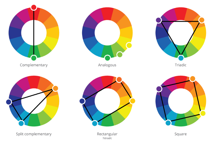
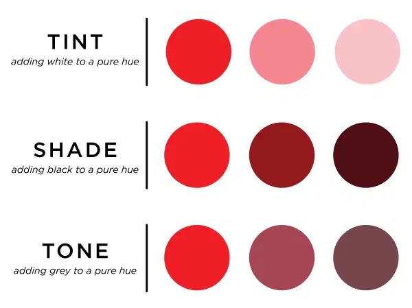
Using these relationships as a tool is usually a safe way to combine colors that work well together. A caveat to keep in mind, especially for beginners, is that colors can vary in saturation, and they can have different tints (mixed with white), shades (mixed with black) and tones (mixed with grey). Keep this in mind while exploring which colors to pair together, as it expands your options.
Color Psychology
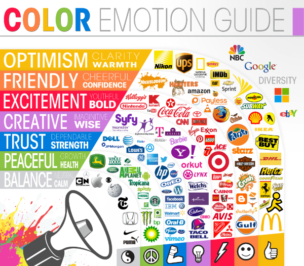
Another crucial aspect to working with colors for UI designs is the topic of color psychology. I think it is fascinating how colors can evoke various emotions and carry different meanings. Have you ever wondered how colors influence our mood? Although our perceptions can differ from person to person, some effects seem to have universal significance.
It's important to note that color associations can vary across cultures and individuals. Let’s look at the color red as an example. In Western cultures, red embodies danger, love, action, passion, energy, and excitement. In Asian cultures, red holds auspicious significance, symbolizing long life, happiness, prosperity, and good luck. It's common for Asian brides to wear red wedding dresses, and for red envelopes filled with money to be exchanged during special events and holidays, like the New Year celebration.
In India, red carries connotations of spirituality, sensuality, fertility, power, wealth, and beauty. Married women often decorate their hands with red henna and apply sindoor along the hairline as a symbol of marriage. However, in some African countries, red signifies death, while in Nigeria, it represents vitality and aggression, and in Iran, it symbolizes courage and good fortune.
source: https://www.daytranslations.com/blog/color-psychology/
Building on our exploration of color psychology, it's fascinating to see how customers also associate specific colors with various industries. For instance, blue often symbolizes the tech and finance sector, green is commonly linked with environment or health-related services, and red is frequently associated with fast-food establishments.
You can use these associations to your advantage by following them or purposefully breaking them. Consider the traditional expectations of your target audience. How might they respond to a departure from the usual color conventions? Would it be a pleasant surprise or potentially disorienting for them? Furthermore, think about the message your design would convey by diverging from these established norms in your industry's color scheme.
Accessibility considerations
Color Contrast
Another trap that I faced when it comes to choosing colors was not considering the color contrast between informative text and its background. Today, I never create a website or app without first checking the color contrast. Why should we, as designers and developers, care about this? The purpose is to make informative content readable to users with moderately low vision. According to the Web Accessibility Initiative, default foreground and background color combinations that provide sufficient color contrast are part of the accessibility principles.
source: https://www.w3.org/WAI/fundamentals/accessibility-principles/
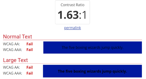
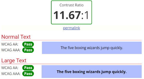
The standardized way for checking the contrast level is by using the WCAG contrast ratios. There are easy ways to test the ratios with the help of a color contrast checker like WebAIM contrast checker

Above are two examples of an unapproved and approved contrast ratio. The scale ranges from 1 (zero contrast) to 21 (maximum contrast). The minimum contrast ratio is 4.5:1, except for large-scale text, which must have a contrast ratio of at least 3:1. I recommend reading on the WCAG official site to learn more about this area.
source: https://www.w3.org/WAI/WCAG21/Understanding/contrast-minimum.html
Color Blindness
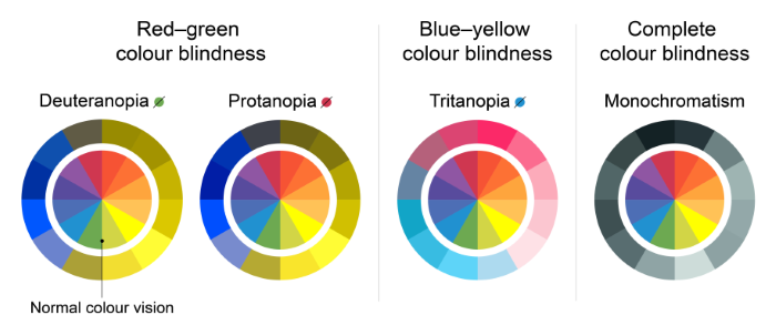
Another consideration to take into account is users with color blindness. This is a vision deficiency that makes it hard to distinguish between some colors. There are three types of color blindness:
- Red-green
- Blue-yellow
- Complete color vision deficiency
source: https://www.nei.nih.gov/learn-about-eye-health/eye-conditions-and-diseases/color-blindness
As a developer, I try to keep this in mind when making decisions about color. It might not always mean that we should not use these colors, but rather that we can employ other methods to convey information, such as adding text or symbols to your design. For example, people generally associate green with success and red with failure, so we can use complementary success and failure messages to cater to users with red-green or complete color blindness.
Put It into Practice
Being more aware of these considerations, let’s revisit the main question: How do we go about creating a UI color palette in practice? This involves a mix of creativity, awareness of current design trends, and an understanding of the impact of color on user behavior. Here are some more concrete tips that I find helpful:
Use the 60-30-10 Rule
Imagining your full design as 100%, you can use this rule as a guideline. This is a time-tested guideline that ensures balance and visual comfort in your design. According to this rule, 60% of your space should be covered with the primary color, 30% with the secondary or supportive color, and lastly 10% with an accent or guiding color.
Taking a web design as an example, use the primary color for larger areas like the background and header, the secondary color for subheadings or captions, and the accent color for buttons or links. I think guidelines like this can be very helpful, but at the same time, it is important not to be limited by them. After all, design is a creative process that's all about innovation and trying new things, going beyond strict rules and guidelines.

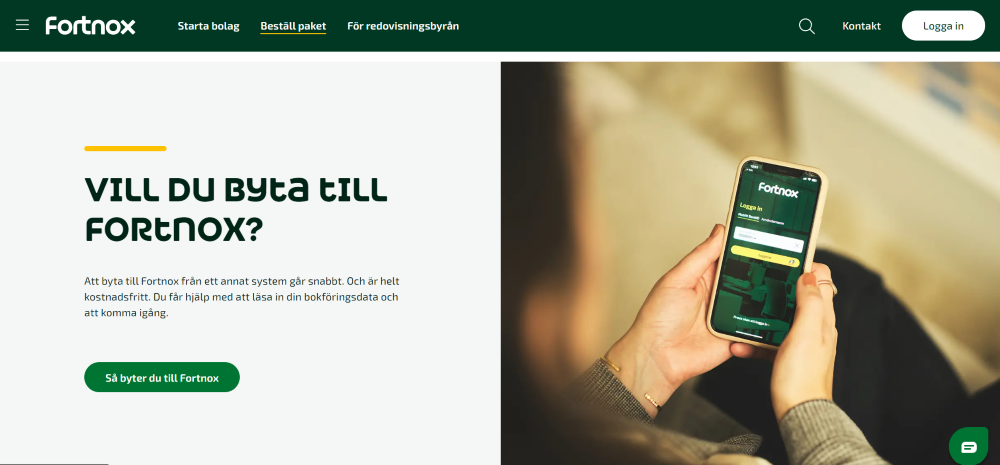
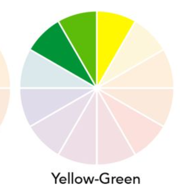
In this website, the use of white comprises around 60%, dark green covers 30%, and 10% consists of accents in green and yellow. The use of greens and yellow is also a perfect example of employing an analogous color combination, as we discussed in the color theory section.
Stick to a Maximum of Four Main Colors
Speaking of guidelines, one that I've set for myself to maintain a clean design is to stick to using a primary color, a secondary color, and one or two accent colors. An example from my own portfolio page illustrates this:

You can see the colors in use here. In this case, I'm not strictly adhering to the 60-30-10 rule, but its general idea is still implemented through the use of primary, secondary, and accent colors. Returning to color theory, here I also utilized blue and coral colors that are opposite to each other on the color wheel and I am using the similar tint and saturation to create harmony between them.

Find Inspiration
Use Pinterest or a similar platform to collect images that relate to the area your application is related to. I like using this method to find inspiration from the colors, shapes, and general vibe that the collected images give me. I think it's an easily implemented idea to quickly gather color inspiration that will feel natural to the design. It will give you an immediate starting point to curate the final color palette.
Here's an example from one of my own projects: an app related to electrical boat engines. As you can see, there is a variety of shades that can be found in the images. These were narrowed down to four or five colors in the end but served as a great starting point.
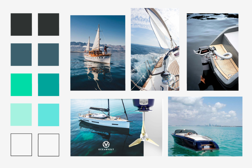
Another way to gather initial inspiration is to use sites that offer premade palettes. These platforms provide a wealth of curated color schemes that can jump-start your creativity, especially if you're feeling stuck or overwhelmed. This is a method I used more when starting out and was at times clueless about where to begin. However, it still proves helpful when inspiration runs dry. Some examples of sites are Colorhunt and Coolors, but there are plenty of other sites out there to explore.
When in Doubt, KISS
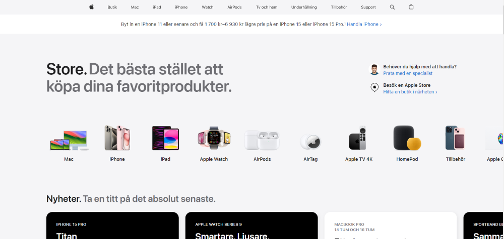
As I was searching for examples of websites to use for this post, I noticed a pattern in many of the bigger, well-used platforms. They kept the colors of the page minimal, often using different shades of white together with the brands colors as the only color pop. Alternatively, some utilized the same idea but switched out the light shade for shades of dark grey and black for a dark mode. This gives a more generic but instantly professional look that is familiar to most users. Below are some examples:


Wrapping up
A point I keep coming back to when discussing UI design with peers is how the subjective nature of design makes this a tricky area to work in. There are essentially as many opinions as there are human beings. So how do we as designers judge what is right or wrong? The answer is we can’t, but what we can do is focus on creating a good, user friendly interface. In the case of color palettes, this means creating a palette by, for example, considering the topics discussed in this post. Of course, there are other ways to approach this; even here, there are no real right or wrong methods.
The real challenge lies in combining these aspects, from gathering initial inspiration to considering color theory, psychology, and the cultural meaning of colors, while simultaneously not forgetting about accessibility aspects. This boils down to understanding your audience and the message you want to convey through your website or application.
